Windows 7 taskbar - new approach
I just love the way programs are organised on new Windows 7 taskbar.
History
In earlier Windows versions to get the program window shown you had to do two things:
check if the program is running by looking at the taskbar and maximise it window if it’s there
if it’s not running, you had to launch it from quick launch or other place
This approach has some major flows:
when you just need a program window to be shown, you have to do a cognitive effort to find where to get it from – either launch the program from quicklaunch (or somewhere else) or maximise its window from the taskbar
if you have, say, ten commonly used programs and put them on a quicklaunch and then open all them up, you’ve suddenly got quicklaunch icons just taking space and doing nothing as the programs are already opened. And you’ve got your programs’ icons in the taskbar – so you effectively have two icons for every program – one for launching a program and one for controlling its window state.
Nowadays
In windows 7 the new approach is taken.
Basically, taskbar and quick launch are combined in one place and then enhanced a lot.
The concept is just great - you don’t need to check if a program is running or not to get it shown – you just click on its icon and if its running, you’ll get its window, otherwise it will launch and you will still get its window. Less cognitive effort, better usability.
One of the implications of this approach is that the space on the taskbar is saved by having “program-launching” and “window-managing” controls combined.
Here’s a screenshot:
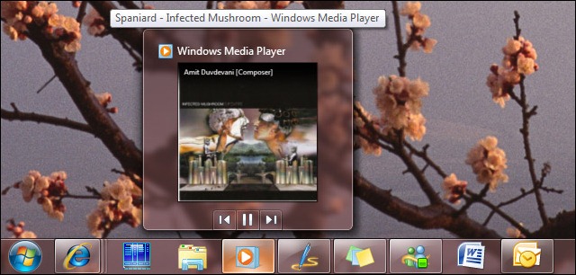
As you can see, Far, Explorer and Microsoft Word are not launched, Outlook, Messenger, Sticky Notes, Live Writer and IE8 are running.
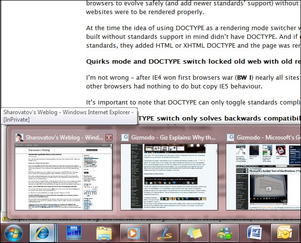
As you can also notice on the screenshot, multiple instances of IE8 are grouped and if you hover them, that’s what you’ll see:
So managing multiple program instances is really easy – when you hover on an item, its window appears on the screen so you can preview if this window is what you were looking for and click on it to open. You can also close any window from the group right from the taskbar.
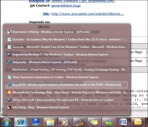
Here’s a screenshot when there’s many IE8 tabs opened:
Again, when you hover on an item, its window is shown, so you either click on it to make it active or close it down.
Another great interface solution is displaying progress bars directly on the taskbar. For example, here’s how IE8 displays download progress bar:
And all the features I showed is just a part of all the goodness Windows 7 taskbar introduces.
So yes, I agree with Gizmodo that Windows 7 Taskbar is much better than MAC OS X dock.


